
A WordPress Theme by Bikram
StoryCraft
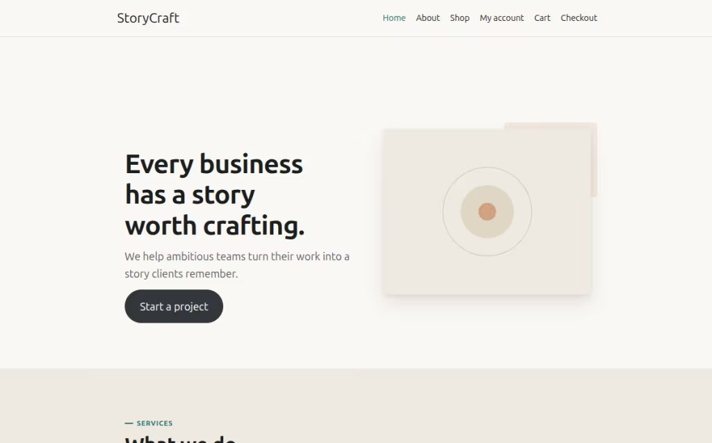
Every business has a story worth telling.
I kept running into the same problem
in WordPress: the themes built for agencies and studios were either so generic
you could swap the logo and nothing else, or so heavy they shipped with a page
builder, three sliders and a chunk of CSS you never asked for.
So I built StoryCraft.
It’s a classic PHP theme for agencies, studios and independent professionals.
Paper-toned, type-led, deliberately opinionated. It ships with twelve Gutenberg
block patterns that do most of the layout work, a working dark mode, an
accessibility layer I’d argue most commercial themes skip, and optional
Elementor and WooCommerce support that stays completely inert until you
install those plugins.
The Big Decision
Why Classic PHP and Not Full Site Editing
This is the question people ask me most, so let me be direct about it.
FSE is where WordPress is heading, and I’m not against it. But StoryCraft is built on a different premise: that most people installing a studio theme want a site that looks considered on day one, not a blank canvas they have to assemble themselves.
So there’s no theme.json, no templates/ directory, and no block-based template hierarchy. The templates are real PHP, which means the front page, the archives, the search, the 404 and the shop are all composed deliberately rather than scaffolded.
Block support is still first-class. I register align-wide and wp-block-styles, define an editor colour palette, and hand-roll the .alignfull band system in CSS. The entire front-end stylesheet is also loaded into the block editor, so the editor and the page are reading the same design tokens.
Foundations
Six Colours, And Everything Resolves To Them
Light Palette
Dark Palette
The warm off-white paper tone does most of the work. Pure white is clinical; a slightly warm paper reads as editorial, and it’s why the theme looks like print without a single print stylesheet doing the heavy lifting.
Dark mode is a second palette applied through a body class, chosen in the Customizer and previewable live. I deliberately didn’t tie it to prefers-color-scheme, because I wanted a real editorial switch rather than an automatic mirror of the OS setting. It also let me pick genuinely different accent hues for dark surfaces instead of just dimming the light ones — the teal that works on near-black isn’t the teal that works on cream.
Typography
A Fluid Scale, With The Serif Held In Reserve
Serif As Punctuation, Not Costume
Headings and body copy both default to a system sans stack. The serif face is reserved for the places where it earns its place: blockquotes, service numbers, statistics, the oversized quote mark on testimonials, and the eyebrow labels.
That restraint is the point. When serif only shows up as punctuation it reads as a deliberate voice rather than a font someone picked in a dropdown. Push it into body copy and it starts to feel like a costume.
I bundled no webfonts. Both stacks are pure system fonts, so the site paints with text already on the device and nothing blocks the first render. For a theme whose pitch is speed, shipping 200KB of WOFF2 to look marginally more distinctive would have been incoherent.
Customizer
Four Presets, And One Token That Does The Work
This is the mechanism I’m happiest with. The stylesheet keeps –sc-font-heading as a variable deliberately separate from –sc-font-sans. Headings read from one, body copy from the other. So a preset can change the heading voice without ever touching body text.
01. Modern Sans
The default. System sans throughout. Choosing it adds no class at all, so the output is byte-for-byte what a fresh install produces.
02. Editorial Serif
Georgia headings over sans body, with heading weight and letter-spacing loosened. Serif reads heavier than sans at the same weight, so the preset compensates.
03. Classic Serif
Georgia for headings and body. Then buttons, the menu toggle, small-caps labels and meta rows are forced back to sans, because small text in a serif loses legibility faster than anything else on the page.
04. Rounded Sans
A soft geometric heading stack (ui-rounded, SF Pro Rounded, Segoe UI Rounded, Nunito) and pill-shaped buttons. The friendly option.
Layout
The Band System
The signature idea is the band: a full-bleed horizontal region that’s either paper or surface tone. Alternating two of them down a page produces visual rhythm with almost no markup, and it’s why the front page, the archives, the 404 and the shop all feel like they belong to the same site. A template that wants a different tone just adds a class.
Two details make it work. A seam rule collapses the doubled padding between two adjacent bands of the same tone down to a single hairline instead of a visible step. And .alignfull blocks escape a constrained column using a 100vw negative margin trick, so a full-width band works even when it starts life inside a normal content region.
The front page template has a piece of logic I’m fond of: it inspects the post content for alignfull or alignwide before rendering, and if it finds one, the automatic hero steps aside and hands the whole region to the editor.
Your content always wins over the theme’s defaults. I didn’t want a theme layout fighting the person typing.
Gutenberg
Twelve Block Patterns, And Where I Spent The Thinking
Every one drops in as a full-width band, so a page built entirely from patterns still gets the alternating tone rhythm for free. You never have to think about section backgrounds again.
Two of them are genuinely different in kind. The Case Study Grid is a real Query Loop — six posts, ordered by date, with featured image, title and excerpt per card. Drop it in and it populates itself. The Featured Case Studies pattern is three hand-authored cards you edit by hand, which is the right call when you want full control over copy and imagery. Both are useful; they’re just useful for different jobs.
Content Model
Case Studies Without A Custom Post Type
There’s no CPT and no custom taxonomy. It would have been easy to add.
Instead, a case study is a normal post filed under a category whose slug is case-studies. Create that one category and you get, with no plugin and no setup screen: a branded “Our Work” archive at /category/case-studies/, a homepage strip pulling your three most recent entries, and a distinct card treatment on the blog index.
The reason is that everything downstream keeps working. Case studies are posts, so they get search, RSS, archives, sharing, comments and every plugin you ever install. The moment you put them in a custom post type you’ve traded all of that for a nicer admin menu.
For most studios that’s a bad trade, and I’d rather the theme didn’t force it.
Elementor
Elementor Support That's Actually Optional
The whole integration lives in one 84-line file that returns before it declares a single function if Elementor isn’t active.
If the plugin isn’t there, that file contributes nothing to the site. Not a hook, not a conditional, not even an empty function. Every call site checks function_exists() before reaching for it. A theme that assumes its optional integration is present is a theme that breaks when the plugin isn’t.
Theme Builder Locations
With Elementor Pro, the theme registers all of the core locations — header, footer, single, archive, 404. Assign a Theme Builder template and it fully replaces the theme's own header and footer.
Full-Width Escape Hatch
If a page is built with Elementor, the theme drops its 56rem reading cap for that page and switches to a fluid wrapper. The sidebar is suppressed too.
Respects 'Hide Title'
The theme reads Elementor's own document settings and, if you've switched the page title off there, it doesn't print one anyway. You never get two systems both trying to be helpful.
Your Typography Stays Yours
A small rule neutralises the theme's negative heading letter-spacing inside .elementor, so per-widget typography you set in the builder isn't quietly overridden.
Commerce
WooCommerce, If You Ever Want It
Same guard, same philosophy. If WooCommerce isn’t installed, the file bails immediately and the theme is exactly as it was. Install it later and a 260-line stylesheet starts remapping the shop onto StoryCraft’s tokens.
You get three-column product grids, square 1:1 product images, accent-coloured prices with struck-through originals in slate, buttons matching the theme’s own exactly, token-mapped notices, tables and forms, and hand-styled quantity selectors for both the classic widget and the Cart block.
The part I’m most pleased with is structural. Rather than styling WooCommerce’s default output, the theme replaces its content wrapper, so the shop renders inside the same main > band > container markup as every other page. That’s why it looks native rather than embedded.
Accessibility
The Part That Surprised Me Writing It
Most themes treat accessibility as a checklist to be ticked. I treated it as an architectural constraint. A lot of the 297 lines of front-end JavaScript exist because of it — and it’s the part I’m proudest of.
WAI-ARIA Disclosure Pattern
I wrote a custom nav walker built for disclosure-style submenus. It deliberately does not add role="menu" or aria-haspopup, because those roles imply an application-style menu widget with its own keyboard model.
Keyboard Behaviour
Real focus traps, auto-opening submenus on Tab, Escape closes innermost submenu, and zero-delay focusout handlers to prevent spurious closure.
Focus & Motion
3px accent :focus-visible outline, skip link, global prefers-reduced-motion kill-switch, and redundant motion opt-outs.
Performance
One Stylesheet, One Script, No jQuery
The entire front end is about 47KB of CSS and 6KB of JavaScript, uncompressed. No framework, no icon font, no webfonts, no CDN, no preconnect hints.
The navigation script is dependency-free vanilla JavaScript in an IIFE, loaded in the footer, and it exits immediately if #site-navigation isn’t on the page. jQuery appears only inside the two Customizer preview scripts, and neither ever loads on the front end.
Two smaller things I made sure of: the homepage’s featured-work query sets no_found_rows, so it skips a pagination count it would never use, and ignore_sticky_posts so featured posts don’t crowd it.
Settings
Fifteen Settings, One Panel
In Practice
Setting It Up
- Activate the theme, then set a logo and a menu under Appearance → Menus. There are two locations: Primary and Footer.
- Create a category with the slug case-studies. That one step switches on the “Our Work” archive and the homepage featured strip.
- Build the homepage. Insert the Hero pattern, then compose the rest from Services, Team, Testimonials, Clients, Case Study Grid and CTA.
- Open Appearance → Customize and pick a colour mode, an accent colour and a typography preset. Add social URLs and the homepage CTA copy in the same panel.
- Set your footer widget columns and drop widgets in.
- Install WooCommerce if you want a shop. Nothing appears until you do.
- Install Elementor if you want page-builder layouts. The theme relaxes its width and hides the sidebar on those pages automatically.
Built by Bikram
StoryCraft is a small theme with a specific idea about what a studio site should feel like, and it sticks to that idea everywhere. It's aimed at agencies, studios, writers and independent professionals who want a site that looks considered on day one and stays fast.
Thanks for reading. If you build something with it, I'd genuinely like to see it.
[View my WordPress.org profile](https://profiles.wordpress.org/bikram_sth/) · [bikramkaji.com.np](https://bikramkaji.com.np)
🚀 Contact Me Today